Over the next couple of weeks, your screens will be flooded by confusing and probably depressing articles about Britain’s budget problems. It’s a good idea to make things as simple as possible, but no simpler. So today I’m offering three charts which I think are an effective guide to how the nation’s finances are actually being managed.
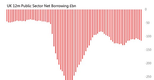
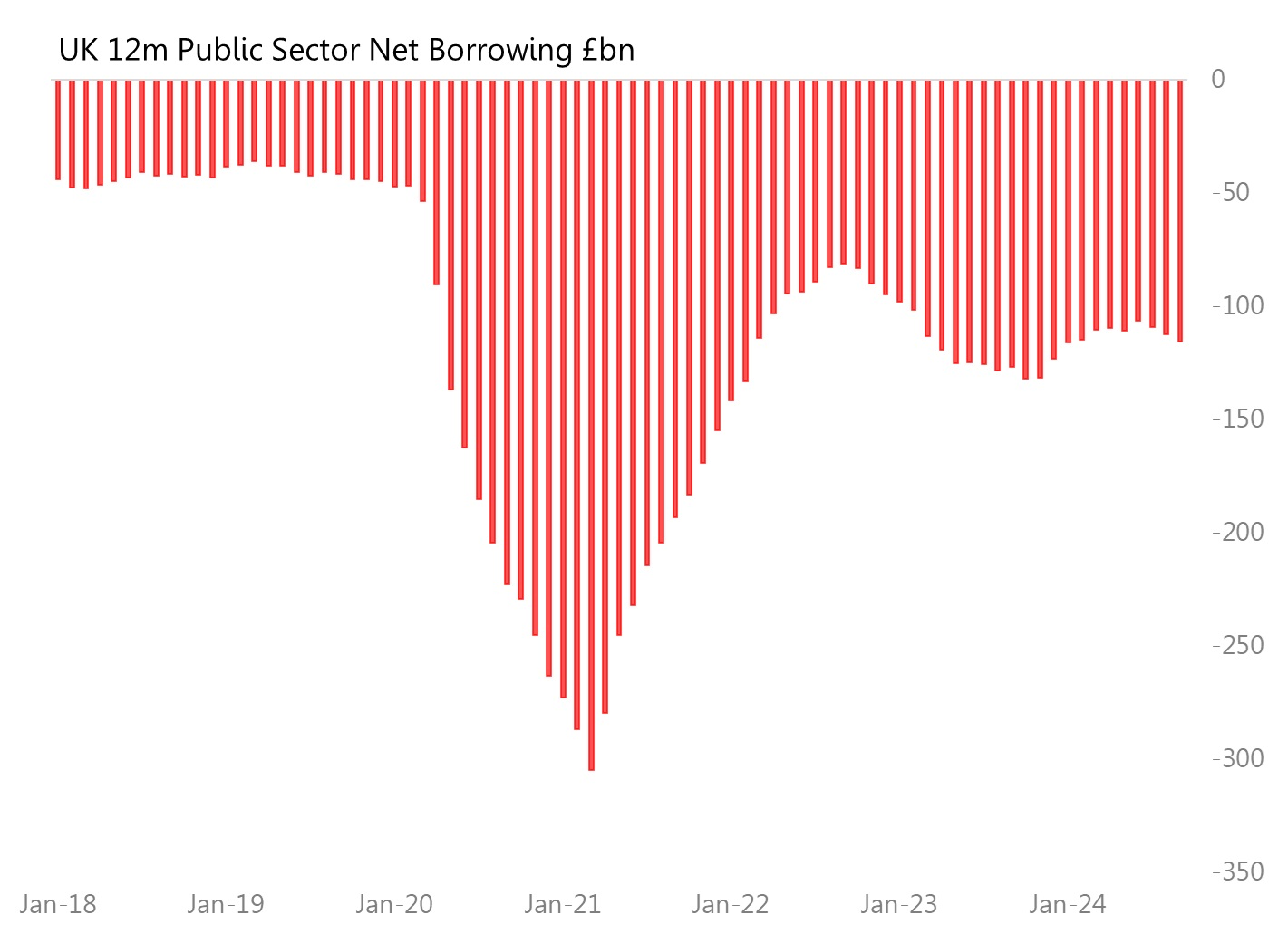
First, here’s the history of 12m public sector net borrowing, up to September 2024. The story it tells is one of colossal blowout during the pandemic, with the 12m deficit peaking at £305bn in March 2021. The next 18 months were spent wrestling the finances back to recognizable shape, so that by Sept2022 the 12m deficit was back down to £81bn. But this was the high-point of budget control - since then, there have been relatively unspectacular ups and downs, but with no concerted attempt to shrink the deficit.
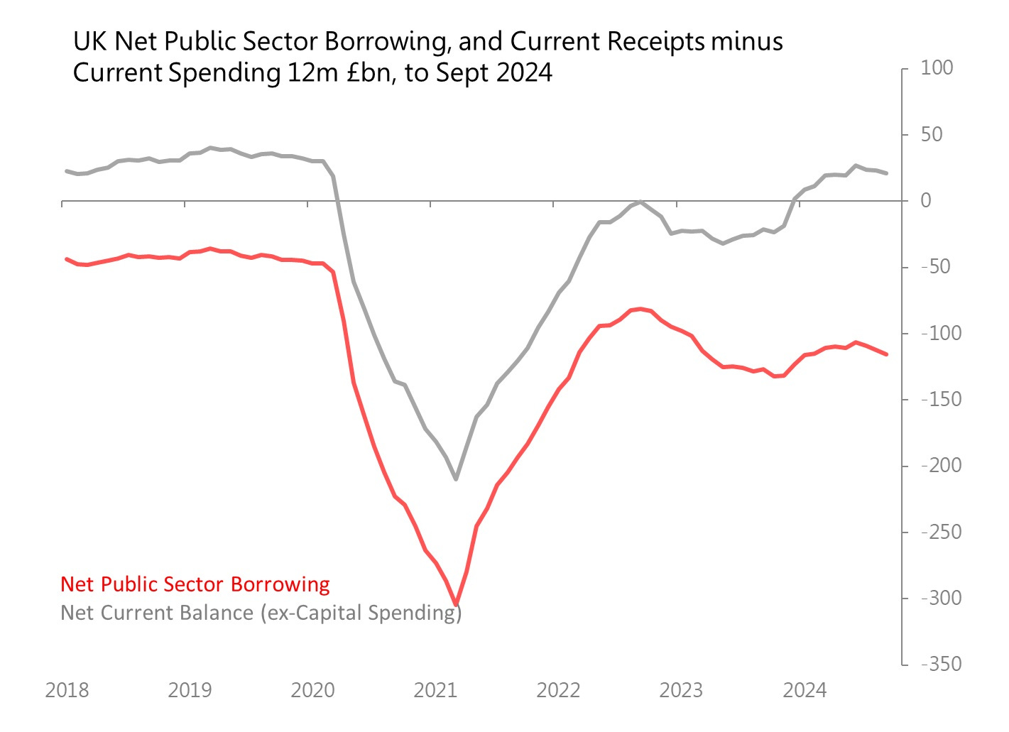
The second chart compares 12m outcomes for the government’s current balance (ie, current receipts vs current spending) and the public sector net borrowing. And look, the current balance, which took such a nose-dive during the pandemic, has recovered effectively completely, and is in surplus!. In the 12m to September, the current balance showed a £21.3bn surplus! Current receipts (that’s your taxes) were up 4.6% 12m yoy, whilst current spending was up just 0.2%.
Current spending, incidentally, includes interest payments on the national debt. You’re going to be hearing a lot about those interest payments, but bear in mind that they account for just 8% of current spending.
So the perception that government spending is wildly out of control, and threatened by spiraling interest rate costs, isn’t true (yet).
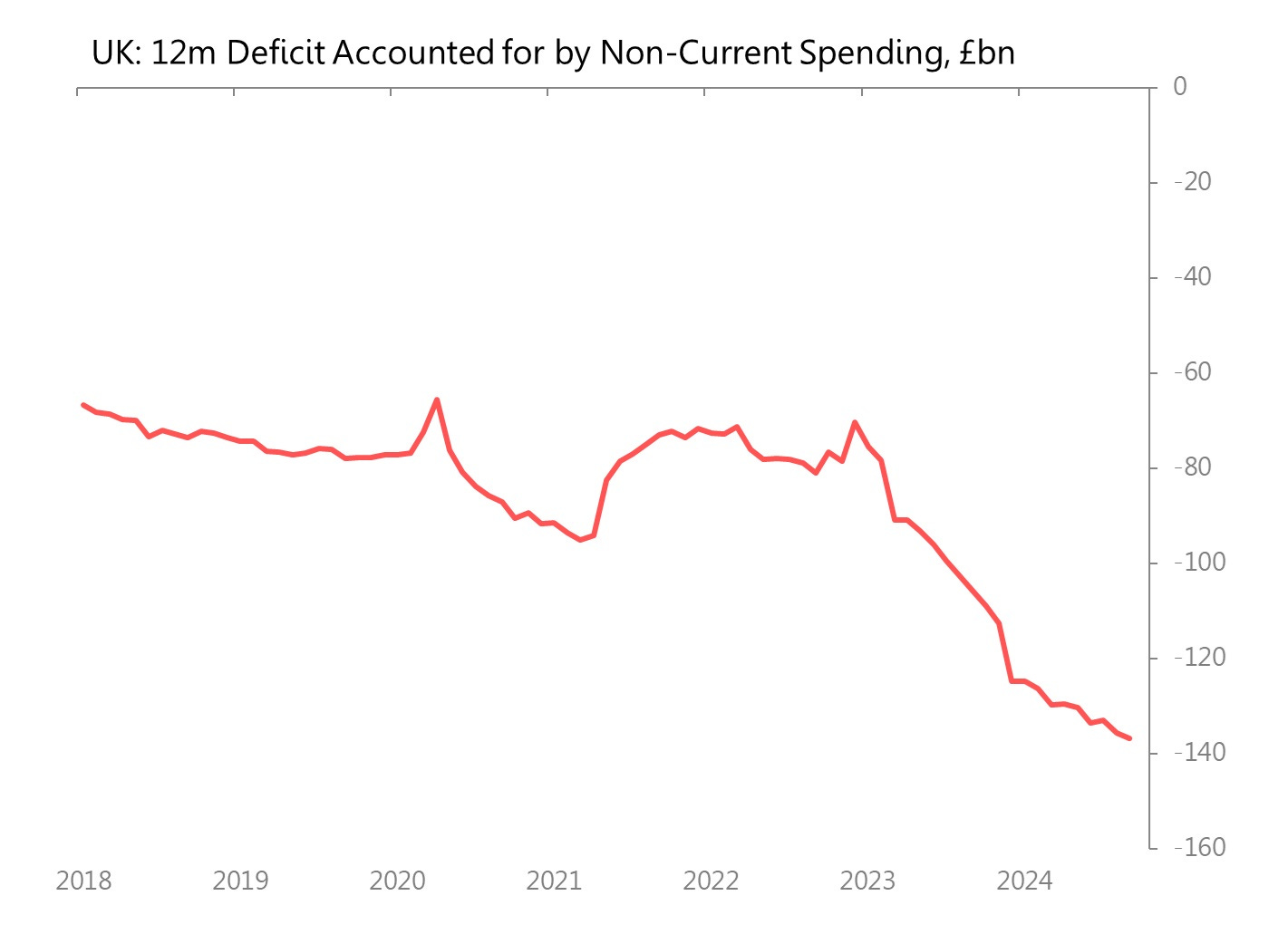
So where’s the problem? The third chart looks at the gap between the surplus in the current budget, and the large debt accumulation showing in public sector net borrowing. What’s left out of the current balance? Well, capital spending mostly. Which is what the third chart shows:
And this chart is the one that’s really doing the explanatory work: with the onset of the pandemic, 12m nominal spending on capital projects (housing, infrastructure etc) was essentially frozen between 2020 and the beginning of 2023. The impact of that freeze in public investment shows - Britain’s public infrastructure is markedly and inescapably run-down. The backlog of necessary infrastructure-rescue spending is what is currently responsible for Britain’s deficit - this capital deficit jumped 30% in the 12m to Sept 2023, and then jumped a further 30% in the 12m to Sept 2024.
In other words, the delayed and now inescapable cost of the pandemic lockdowns was allowing the erosion of Britain’s infrastructure, followed by the delayed and very expensive necessary repair and maintenance bill.
That’s actually what happened. The rest is mere detail.


How much of this capital spending problem would be addressed if all these capital projects (probably impoosible for a lot of them, but bear with me) actually charged for their services? Pay per mile road charging, explicit tolls, if hospitals paid market rents (I presume they don't) etc?
The reason I ask is, if capital projects paid rent / fees / etc, then they would be genuine investment assets. Treasury would have at least some incentive to build them. If arranged appropriately, there would be some competition between the infrastructure so there would be an incentive to keep them operating properly ie. to keep up their spending. Perhaps there might even be a sinking fund for this purpose (heaven forfend!).
More than that, if there was an interest payment coming out of this investment, you could get a lot of the funding from insurance companies and pension funds. The government would need to take the equity stake for ownership purposes but also so it was the government that absorbed the cost overruns, but a lot of it could simply be funded privately.
Is it actually quite simple...and the Treasury can't see it or am I missing something very large (and possibly elephant shaped)?